AIGPL Office is redefining the workspace environment as we know it. ‘Redundancy’ becomes every employee’s worst nightmare. To prevent this risk, Azure Interiors have designed a workplace for AIGPL, Raipur. To fight the same, Azure interiors have designed a workplace for AIGPL, Raipur. The project is located in Raipur and spreads across 3,000 sq. ft. of land. The designers describe the project as, “A place where the employees would want to be, not where they have to be”. The interiors in white radiate warmth and comfort. The entire workspace is adorned with multiple elements including books, artefacts, signage, and furniture. These make it a dream location to work in. The culmination of such elements is delightful to look at in the workspace.
AIGPL Office – The Design Concept
A workspace should not only be a space where one works for the growth of the organisation. It should also be a place where they feel good about their job when they step in. A healthy workspace environment reflects the overall growth and mental health of the employee. The cubicle, where one spends most of their time, could be a trap for one’s personal growth, leading to stress and anxiety. Studies show that people stressed at work tend to be much happier on the weekend. But is that what the quality of one’s life has come down to in today’s world? One can only find answers to these questions by trying out newer ways to break the mould of the traditional idea of a workspace environment.
The Workspace
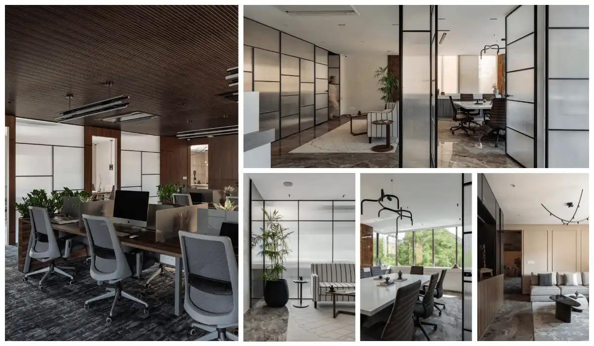
Azure Interiors have designed a workspace that radiates a warm feeling and does not feel like a traditional workspace. The breezy and welcoming ambience of the space ultimately results in improved productivity and the overall vibe of an employee.
The designers describe the space as, “A place where the employees would want to be, not where they have to be”.
The Colour White
The colour white dominates the entire work area. To add more life to the space, a combination of fine materials and graceful elements have been added. Elements such as plants, antiques, and photographs complement the overall vibe of the project. The diverse work spaces have been designed thoughtfully to work coherently without hampering the functioning of the organisation.

The Office Ambience
As the office belongs to a construction company, black and white photographs of their projects are on display in the corridor. On either side of the corridor, the workspaces allotted for multiple departments of the organisation are designed with glass partitions. The use of ample natural light and a neutral colour palette keeps the ambience of the workplace positive. The simplicity of the furniture used in the office space is what makes it unique. The cabinets and drawers are white and remind one of the cabinets one would find in their own study room.
The Waiting Area
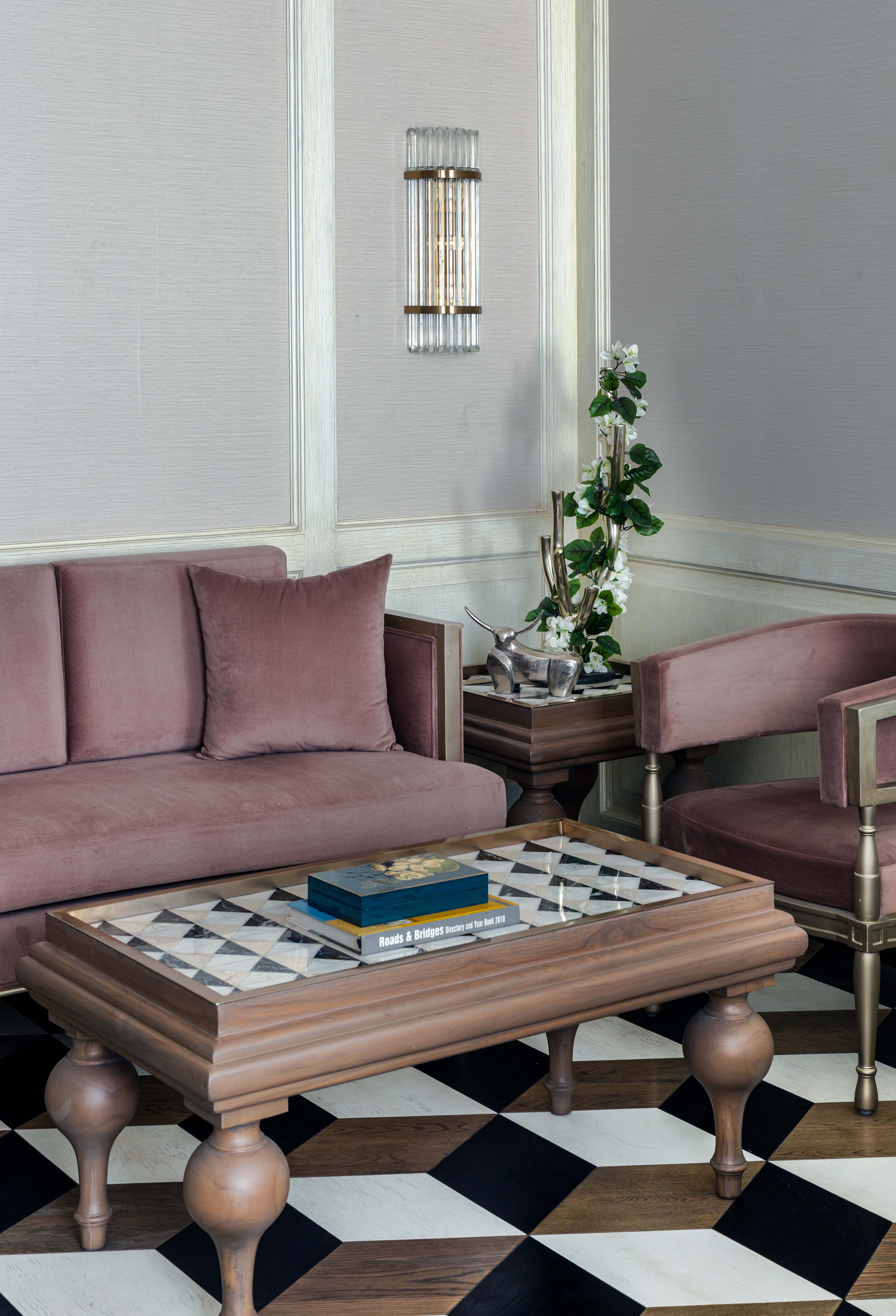
Natural light floods the waiting area outside the cabin. The classic furniture used in this space is refreshing to look at. Small plants adorn the corner table on the left side of the sofa. Similarly the corner table on the right has a globe and some books. The chair and the sofa have a unique look and compliment each other. The round and elongated cushions used for the sofas are pink. These stand out against the remaining furniture, which is white. The open shelving used in the waiting area has compartments with horizontal and vertical wooden partitions against a white backdrop. These hold books, antiques, and small plants, adding to the aesthetic beauty of the space.

The Flooring and other Design Accents
The grey carpet laid on the flooring compliments the white coloured walls. The carpet carries names of the spaces where the path leads to. Thoughtfully incorporated into the design, it replaces the typical way of having name-plates outside. The classical mouldings and the knobs used in the design are responsible for making the project look rich.

Instead of using typical nameplates, the designers employ brass inlay directions on the micro cement floor to add an eye-catching feature.
The Cabins
The cabins and meeting rooms use intricately patterned floor tiles. These create a dynamic look while demarcating the various spaces based on their use. Plants used in multiple areas in the project including the cabins make the space more lively. The vintage furniture used in the cabins looks elegant.
The Furniture and other Decor Accents
The sofas, chairs, tables, and accessories used to decorate the cabin possess an old-world charm. The four-legged coffee table placed in front of the sofa and the corner table are uniquely carved. The legs of both tables bulge at the top and gradually taper towards the bottom. The tabletop, adorned with a similar pattern as that of tiles, looks graceful. The CEO’s executive desk is wide enough to accommodate the tools, stationery, and personal artefacts they require to function efficiently and personalise their space. The overall character of the cabin looks authoritative yet elegant.

The Grey and White Colour Palette
The grey and white colour palette dominates the project and looks elegant. The furniture design certainly deserves a special mention for setting the tone for the entire project. The designers adopt a classic and elegant theme that is unique and well executed by the craftsmen. The selection of artefacts and antiques done thoughtfully, keeps in mind the overarching aesthetic of the office. The white backdrop provides an interesting canvas for the artefacts and antique pieces to stand out. The overall ambience of the space ensures employees want to be in the space even after office hours. Designed with the notion of breaking free from the mould of the traditional office environment, this project exudes a homely vibe without losing its elegance.
Visit: azure-interiors.com
Email: louis@azure-interiors.com
Contact: (801) 821-2922
Discover more from Biltrax Media, A Biltrax Group venture
Subscribe to get the latest posts sent to your email.


