Abode by the Bay brings in the view and breeze of the sea. Designed by Open Atelier Mumbai, Abode by the Bay is a contemporary-style apartment. Located in the heart of South Mumbai, it is along the Nepeansea road. The 1,800 Sq. ft luxuriously designed house accommodates a family of 5. It comprises the living room, the dining space, the kitchen and three bedrooms. With the notion of capturing the serene beauty of the sea, the team led by Rahul Mistri at Open Atelier Mumbai have opened up the residence in a way that it brings in the breeze and sound of the waves to blend with the design scheme. The well crafted detailed furniture exudes a plush feeling along with the grey-tinted walls.
Abode by the Bay – The Public Zones
The Lobby
On entering, the elegantly designed lobby that acts as a transition space between the indoor and the outdoor environment. The designers have treated this cohesive space such that it seamlessly opens up into the spacious apartment. The ambience of this space reflects modernity and elegance. A vestibule connects to a long passageway leading to the dining room, living room and kitchen. Thoughtfully positioned, the black translucent wooden partition obstructs the vision while creating a sense of curiosity in our mind. It provides necessary privacy to the homeowners.
The Living Room
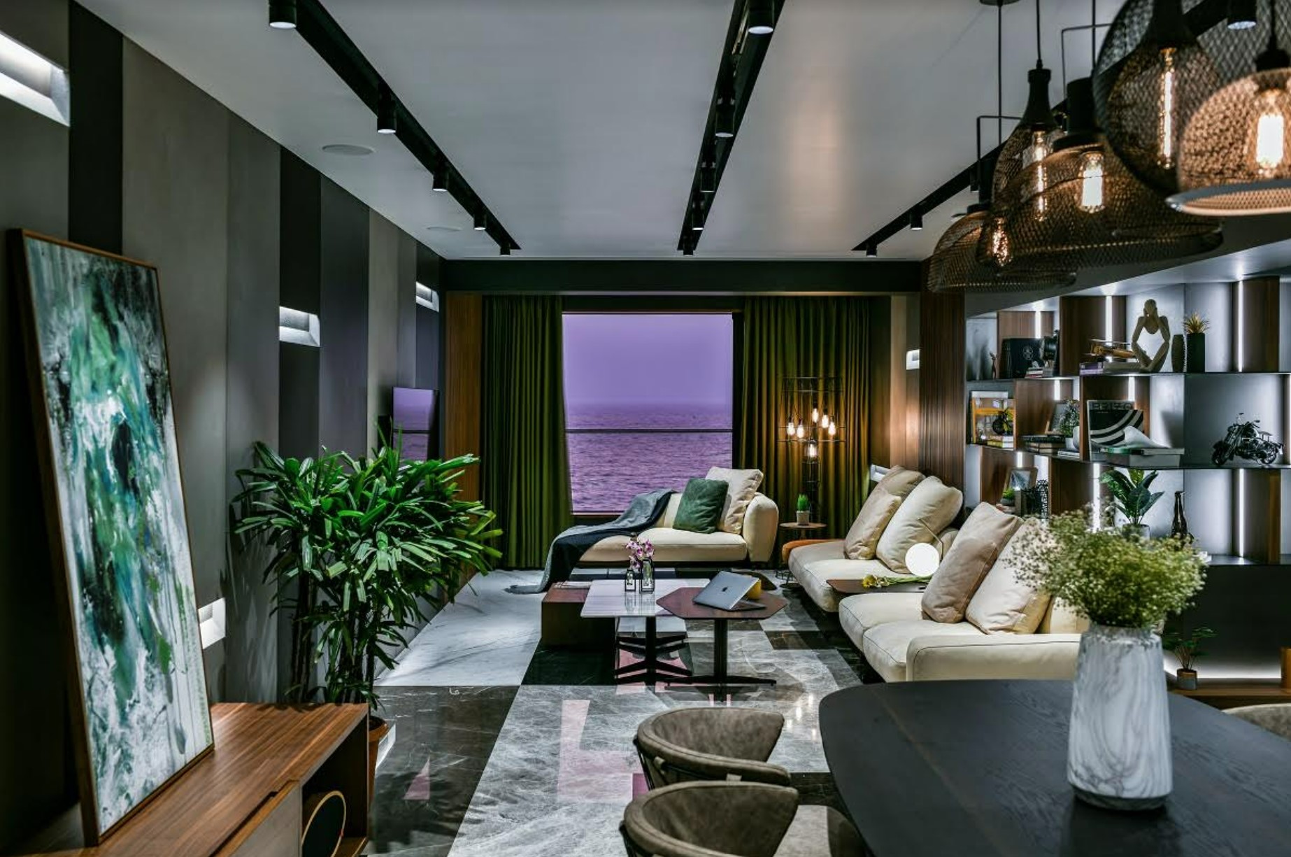
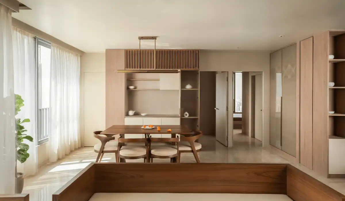
Designed to feel airy, the living room has the Arabian Sea as a backdrop. It act as a connecting space for the lobby, the kitchen, and the bedrooms. The colour grey dominates the entire home. The designers picked a palette of five different shades of grey throughout the home. The windows in the living room face the Arabian Sea, bringing in fresh breeze. For the flooring, a combination of four different types of polished Italian marble have been used to create a unique contrast between the walls and the floor.
Sleek magnetic track lighting has been used for the ceiling. This lighting runs across linearly, positioned appropriately in the living and the dining room. The wall panelling is done in 3 mm Neolith and Laminam stone tiles. These have a playful combination of grey tones and ambient lighting installed in the grooves to compliment them. This wall does not have any movement happening on or around its surface and acts as a backdrop for the television.

The Library
The design team adopted a unique approach to design the library. Designed using fabricated metal, the combination of horizontal and vertical wood-finished divisions lead to an exciting play of form to display books and artefacts. These horizontal and vertical wooden divisions run across the walls that connect the living and dining space. The open kitchen adjoining the dining room allows free movement across the dining space overlooking the living room. The grey tones flow in the kitchen with darker shades as highlights, complemented by a partially finished Statuario stone.
Abode by the Bay – The Private Zones
Following the overall concept adopted for the “Abode by the Bay”, the bedrooms overlook the picturesque view of the Arabian Sea. The colour scheme and palette used in the bedrooms, establish the ‘bold and elegant’ design intent of the house.
The Master Bedroom
In the master bedroom, a four-poster bed fabricated in stainless steel is located in the centre of the room. On one side of the bed is a wardrobe having clear glass shutters and black hues. The grey coloured wall behind the bed and the wooden flooring together gives the room a feeling of luxury. Multiple lamps that act both as sources of illumination as well as objects of decor are present in the room. The window treatments used, provide for a neutral and elegant backdrop, complimenting other elements in the room.

The Master Bathroom
The master bathroom has a sleek bathroom vanity with warm-hued under-mounted lighting illuminating the floor. The bathroom design incorporates concrete vitrified tiles. These look trendy along with the Calacatta marble used on the walls. With a combination of black, grey and brown, the overall space exudes a sense of calm.
Grey tones in the master bedroom are backed by a concrete-textured paint finish by ICA and Mecasa on walls and a hybrid wooden flooring by Xylos.
The Son’s Bedroom
The son’s bedroom design is functional yet unique. The room has a platform bed in a comforting corner. Additional storage, thoughtfully concealed inside the platform, makes the room look neater. The primary wardrobe is located on the wall adjacent to the attached bathroom and blends seamlessly with the overall design. The designers have incorporated a recessed wooden shelving system adjoining the bed which is functional yet aesthetic.
The hybrid wooden flooring by Xylos and the quirky bespoke armchair add depth to the simplicity of the design. The walls and the ceiling have a unique pattern of triangles, painted in different complementary hues in pastel colours with grey undertones. The patterns add a pop of colour to the otherwise neutral colour palette in the room while merging gracefully with the other elements in the room.

The Grandparent’s Room
The design team adopted a minimalist approach for designing the grandparents’ room. The room has been designed in a fashion wherein one feels calm yet playful at the same time. Designed to exude a comforting feeling, this room displays elegance without taking away from the simplicity of the space. The bed is placed in the centre of the room with a marble backdrop. The marble backdrop and the flooring in black, grey, and white chequered tiles by Bharat flooring. These add to the overall plush feeling that the room radiates. A coffee table has been added alongside the window. This enables users to enjoy the plush view of the city.

The material and furniture fit in well with the overall scheme of modern and smart design, with comfort being a primary design factor.
The home is interwoven with a combination of subtlety, sophistication, and comfort. The open and airily designed residence adds to the contemporary feeling and enhances the quality of life of its inhabitants. The use of grey tones connects the space coherently. It lets the design ‘flow’ while not compromising on the overall material palette. The design team at Open Atelier has designed the residence to radiate a more urban vibe. The design hopes to resonate with the plush landscape of South Mumbai while keeping the client’s requirements as a priority.
Visit: www.openateliermumbai.com
Principal Designer: Rahul Mistri
Email id: info@openateliermumbai.com
Photo Credits: Prashant Bhat
Discover more from Biltrax Media, A Biltrax Group venture
Subscribe to get the latest posts sent to your email.


