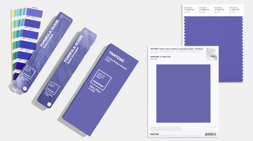
The Pantone Colour Institute announced Very Peri as the Pantone colour of the year 2022. They have defined ‘Very Peri’ as a colour that encourages inventiveness and creativity in people through its bold presence. The hue is a unique blend of calming blue and an imaginative undertone of violet-red.
The colour is a reflection of the current global scenario of transformation and innovation. This iconic colour is representative of the spectrum of emotions experienced by the public owing to the COVID-19 pandemic, both during and after the lockdowns. It is reflective of the fighting spirit, joyfulness and helping nature of citizens all over the country and the world. Coming from two different colour tones/families, this colour also depicts adaptability that is related to the major lifestyle transformation the mass had to go through during this pandemic.
The tints of this unique colour are also found in nature and can be strategically incorporated into man-made spaces. The colour illustrates the future of modern lifestyle and the trends in the digital and physical world.
Here’s a quick guide that will help you use the Pantone Colour of 2022 in its best light, both in interior and exterior spaces.
Building Facade
The unique texture of every material brings out a different shade of Very Peri, rendering an enigmatic appeal to the facades. Very Peri can be used on facades in multiple ways, including adding a pop of colour on balcony surrounds that is very reminiscent of the Art Nouveau style or in the form of aluminium composite panels for modern high-rise buildings to name a few. Utilizing tinted glass as a vented barrier in the form of louvres or as a customized design of stained-glass windows are some other additional ways to highlight the colour on facades while maintaining a more muted colour palette for the overall facade.


Landscape
Tints of this bold, iconic colour can also be found in nature in the form of plants, particularly succulents, flowering plants and climbers and creepers. This vibrant/unusual colouring is usually caused by a pigment called anthocyanin. Succulents such as Echeveria and Dusty Rose are examples of these plants and can be used to adorn both interior and exterior spaces. Good examples of using these plants include climbers like Wisteria that are traditionally used for landscaping in front yards, garden walls and canopies. The additional presence of a water body creates a blissful ambience by reflecting this colour into the surrounding addition of neutral tones in the form of stone and tiles that maintains this balance.


Glory in Very Peri.

Adorn the pathways with very peri in nature.
Accent Walls
We all love the iconic front door of Monica’s apartment from the TV show F.R.I.E.N.D.S. Painted in a bright, bold purple, this door brings in the nostalgia factor that can be replicated using Very Peri, a colour that is very similar to the one used in the apartment.
A good way to replicate this nostalgia and to steer away from neutral-toned walls is to highlight one wall using Very Peri, to give the space an eclectic vibe.

A pop of colour to highlight the Architectural feature.


Bathroom Tiles
A great way to break the monotony in bathrooms is to use Very Peri coloured wall tiles as accent tiles. In kitchens, using Very Peri hued back-splash tiles in various shapes and patterns is an excellent way to make a statement and stand out.


Statement Furniture
To make a statement and to capture the attention of guests is by adding the subtle tone of Very Peri into individual pieces of furniture such as side tables, console tables or sofas and armchairs. The striking hue accentuates the room by focusing the eye on a single item.

A Very Peri dimension in our workspace.


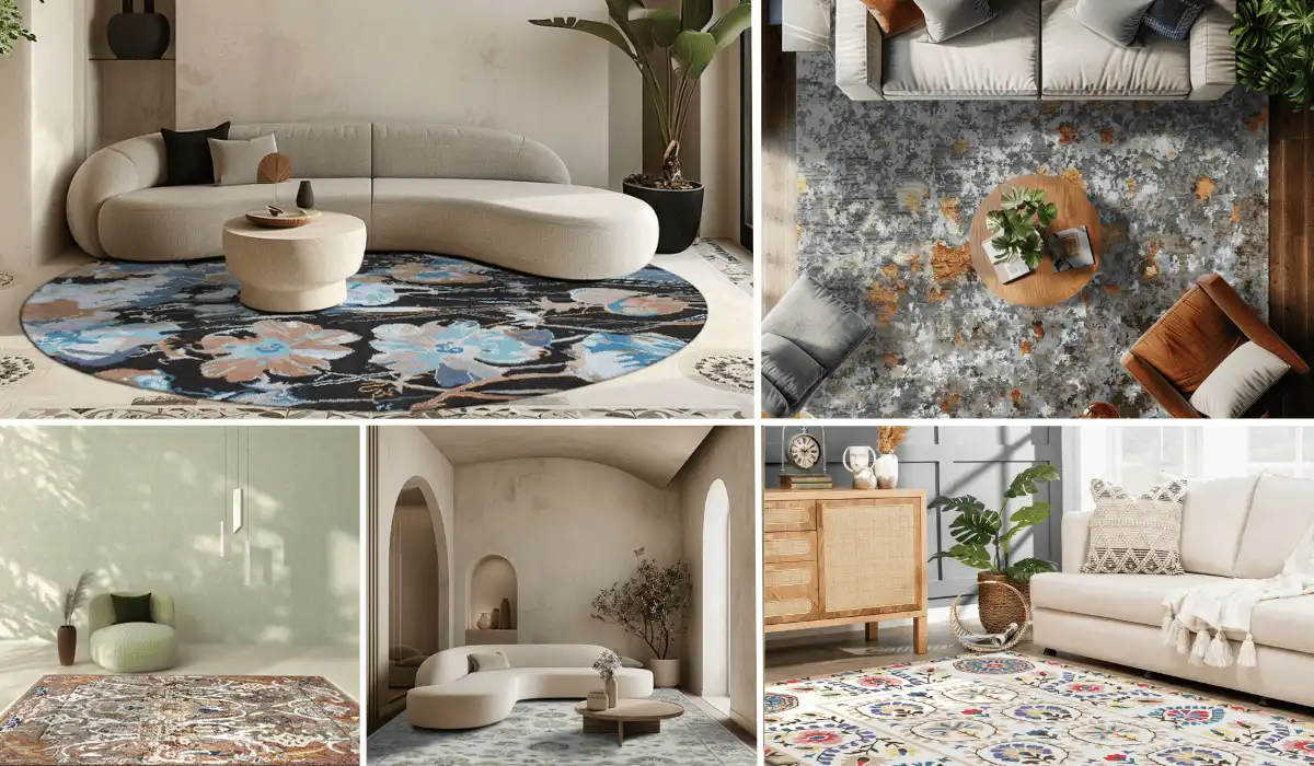
Soft Furnishings
A room is incomplete without soft furnishings. Very Peri can be used to infuse a pop of colour and pizazz throughout various interior spaces in the form of soft furnishings such as bed linen, curtains, rugs etc. Experimenting with textures is always a good idea and satin, faux fur, natural jute are good examples of textures that can be dyed in tints, tones, and shades of Very Peri.


Art and Decor
Very Peri is a one of a kind shade that pairs well with white, beige, pink, blue and green colours. To achieve an effect of serenity, the colours can be included in the form of artefacts. By including small elements in this eclectic colour palette, one can add a sense of playfulness to an otherwise dull and dreary space.
We hope to see more of this colour in your everyday life and decor, making Very Peri very evident indeed.


Biltrax Construction Data is tracking 17000+ projects on their technology platform for their Clients. Visit https://www.biltrax.com/ or email us at contact@biltrax.com to become a subscriber and generate new leads.
Disclaimer: The information contained herein have been compiled or arrived at, based upon information obtained in good faith from sources believed to be reliable. All such information and opinions can be subject to change. The image featured in this article is only for illustration purposes and does not in anyway represent the project. If you wish the article to be removed or edited, please send an email to editor@biltrax.com
Discover more from Biltrax Media, A Biltrax Group venture
Subscribe to get the latest posts sent to your email.