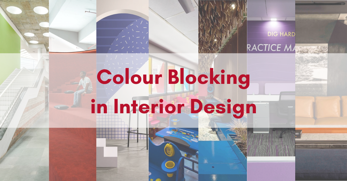
What is Colour Blocking?
Colour Blocking refers to a selection of colours that are complementary. We use these colours for making a bold and a definitive statement in fashion and interior design. The colours chosen for these offer a simple yet lasting imagery of a place with their contrasting shades and nature. Colour Blocking has had its influence over the years, from various European Art Movements; from Claude Monet during Impressionism to Georges Seurat during Pointillism in the Post-Impressionism era, which transcended into De Stijl’s movement founded by Piet Mondrian. It flowed into Pop Art and Suprematism, inspiring both Andy Warhol and Kazimir Malevich to follow in its colourful footsteps.

Why is Colour Blocking Used in Interior Design?
- The Freedom to Design
Colour Blocking offers people, be it clients or designers, the freedom to carve out their dream project and watch it manifest in real life. There is no restriction in choice of colour for colour blocking. This results in the generation of individual design statements, which allow people to explore their creative sides.
- Inclusion of Shapes and Angles
Colour Blocking is not only limited to colours. It also involves various shapes and angles which make intriguing compositions. These formations can be an amalgamation of various contrasting colours. They can be monochromatic and include just many tints and hues of one colour. There is certainly no limit to creation with this style.
- Includes Every Aspect of Space
Colour blocking does not limit design to a three-dimensional space. It includes a variety of things which come together to form the overall ambiance of a space. Colour blocking involves a vast spectrum of furniture, rugs, and lights along with the walls, ceilings, and floor to create a signature style which attributes to the choice of the owner.
- Mix and Match
There are various layers involved in colour blocking. One layer includes mixing and matching of several materials on the floor and walls amongst each other. Combining a new material with a rustic one and using neutral tones with bright ones for a lasting effect are just some ways to achieve the desired results.
- Abstractionism
Along with juxtaposition and other paradoxical elements, colour blocking possesses a quality of being abstract with all the things. It shatters the notion of conventional styles and establishes its own contemporary nature suitable to the selector’s choices.
- Colour Wheel
The colour wheel influences a major portion of the design process for bold, eccentric colour schemes, which play the protagonist in this style. The colours complement each other to create a stark contrast. Examples include cold and warm colours, patterned and solid blocks and neutral and bold shades.
What makes Colour Blocking helpful over other styles?
- Colour Blocking is very subjective. One can go as creatively as they want about it.
- There are no restrictions for selecting textures, shapes, and angles. There is freedom to design and integrate as many elements as one wants.
- Several European Art Movements influenced it, which suggests that it has a long and rich past despite being a post-modern style.
- The colours have a contrasting nature which is extremely attractive to look at and makes the viewer interested in the design style, however minimal.
What makes Colour Blocking Disadvantageous over other styles?
- In visual fields, there is no strong consensus on the usage of bright and many colours.
- While some combinations may look bold and fresh, others look at disharmony and rupture the general aura of a space.
- It is an experimentation with abstractionism for individual self-satisfaction, but does not hold a true essence of a design style.
- It does not follow the conventional norms of design and colour, which results in a very vague design and execution.
Glimpses of Colour Blocking in Different Articles featured on Biltrax Media
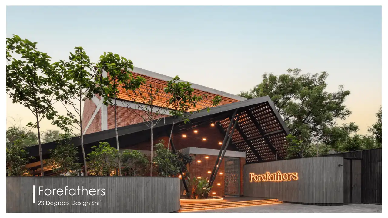
Recent addition to Jumpstart Preschool by Mind Manifestation Design
Designed by Mind Manifestation Design, the building extension has transformed Jumpstart Preschool into the most visited preschool in Pune. The space contains sports-discussion and sit-out areas, staff workstations, and the CEO’s cabin. It has an unmissable 90s era vibe to it.

attention of visitors
Udaan School by AVT Architects
A school is not only a facility for education but also a second home where students spend most of their time in their nurturing years. It should augment creative thinking, inspiration, a developing sense of awareness and responsibility. Acknowledging these aspects, and incorporating them into their design, Studio AVT has completed Udaan School in Delhi in 2020.

Very Peri
The Pantone Colour Institute announced Very Peri as the Pantone colour of the year 2022. They have defined ‘Very Peri’ as a colour that encourages inventiveness and creativity in people through its bold presence.

Scala Home
Scala Home launched a flagship store of B&B Italia and Flos. In New Delhi’s Design District on MG Road, the beautifully designed store showcases the iconic creations of B&B Italia and Flos elegantly.

BYJU’s Office
The architects describe the project as a hybrid space, designed to fulfil both the needs, imparting education and carrying out smooth functioning at the back end.

Museum of Socialism and Jayaprakash Narayan International Centre
The Jayaprakash Narayan International is an attempt to create a premise inspired by the life of the renowned socialist – Jayaprakash Narayan. The museum and a convention centre aim to be an international representation of the timelessness and plurality of Indian architecture and culture in Lucknow.

Rane Vidyalaya School by Shanmugam Associates
Expedient and traditional architecture, sensible and built of local materials, Rane Vidyalaya can easily become the face of contextual and vernacular approach to architecture in India.

Sources:
- 9 Color Blocking Ideas for a Bright, Cheery Home
- How to Use Color Blocking in Interior Design
- Understanding the Concept of Color Blocking in Interior Designing
- 20 New Rules for Color Blocking at Home
- De Stijl Movement
Discover more from Biltrax Media, A Biltrax Group venture
Subscribe to get the latest posts sent to your email.